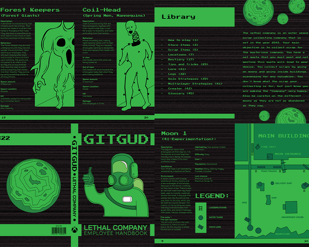
A printed piece for a concept idea on how to get better at videogames. A game guide that releases different issues for specific games. I emulated an old computer terminal with the pixelated type and green/black colour scheme for the overall look. Each issue would have a certain style catering to what the game is. A retro approach on new generation videogames to invoke a sense of nostalgia to readers. Also an easy and simple visual to navigate through complicated content that new game offers.
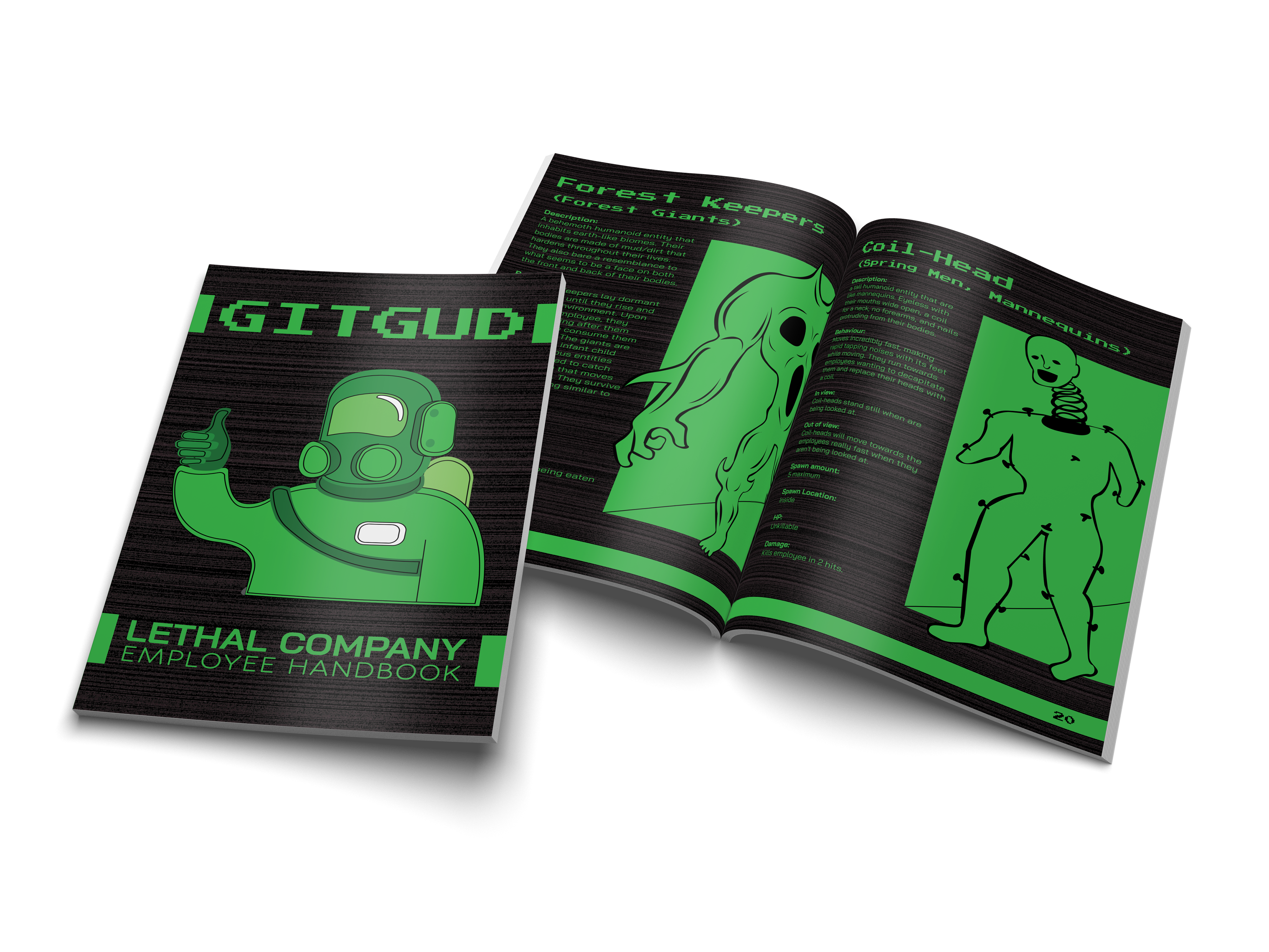
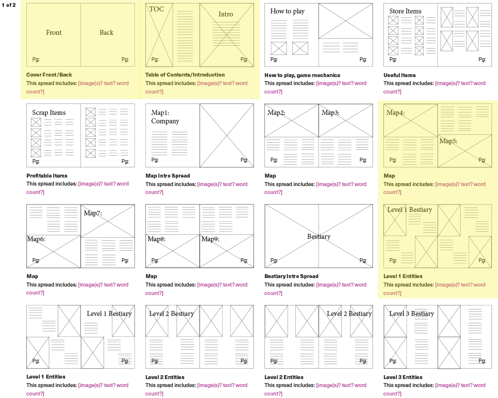
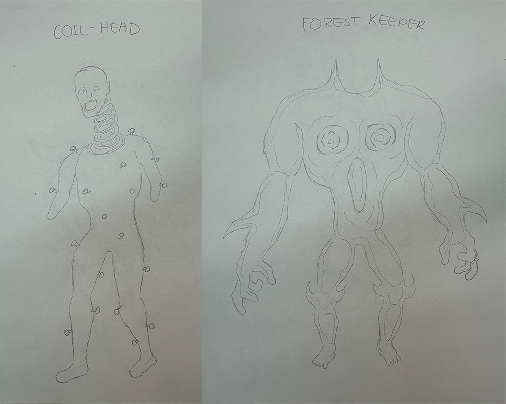
I create a flatplan to show how to navigate through the printed piece and to plan all my content. During this stage I also plan out how each spread is going to be laid out. I then put them in order to see which spread would make sense to feature. I create illustrations for the spreads according to the flatplan. After all of this, I put them together and start playing with type and colour. I polish up the design and mock it up to see how well they look.