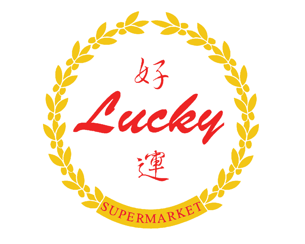
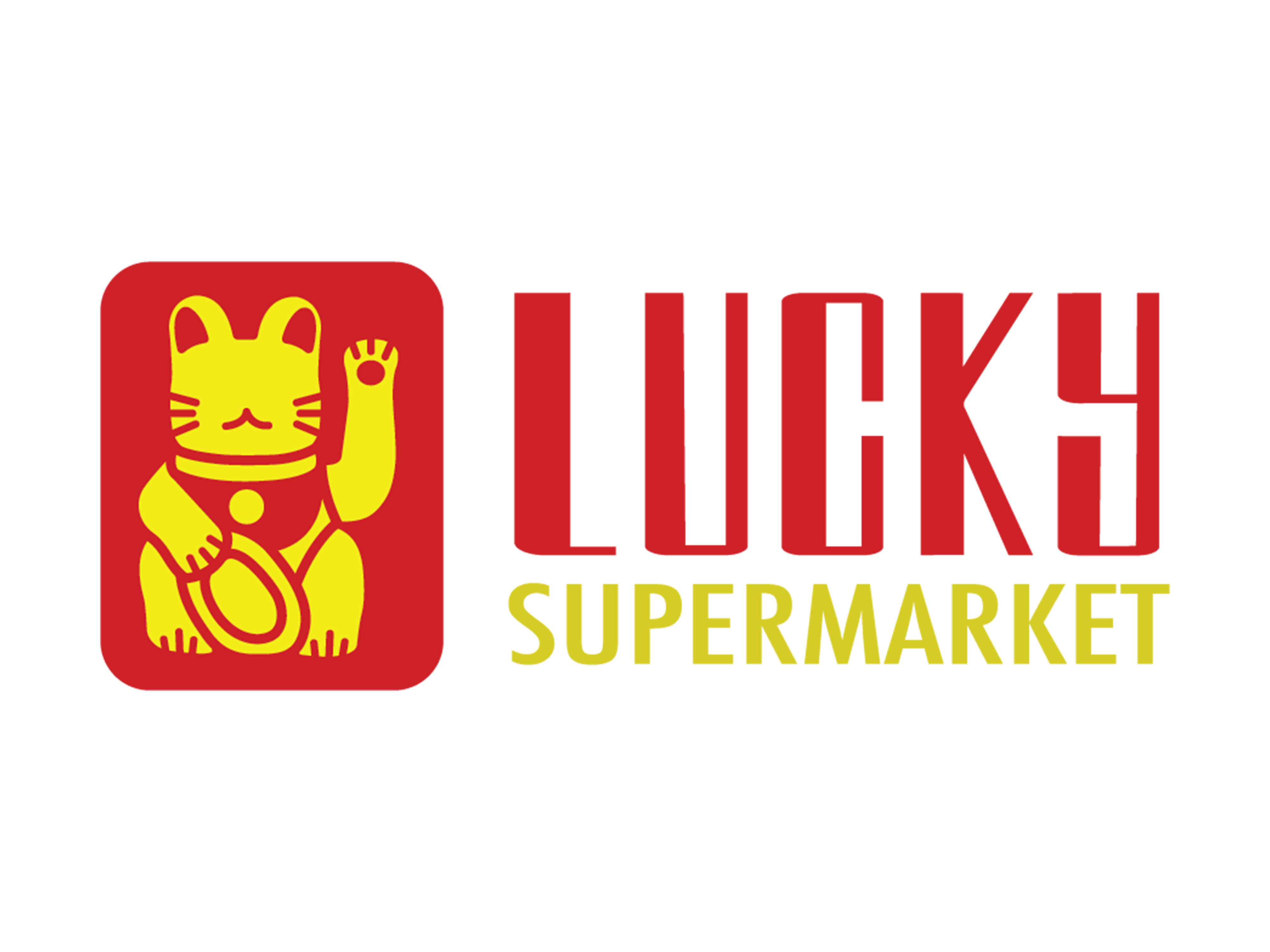
A logo redesign on the asian supermarket “Lucky Supermarket”. I went with the “Maneki Neko” or “Lucky Cat” as the main illustration to give the brand a visual while retaining the original colour scheme. The goal is to make the brand recognizeable through the logo. I kept the red and yellow colour scheme to keep the asian culture of the brand. The cat is a good visual to associate with the brand, because the cat is popular in asian cultures as it represents good fortune and the name of the store is Lucky.
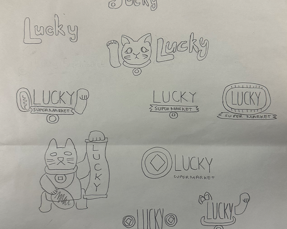
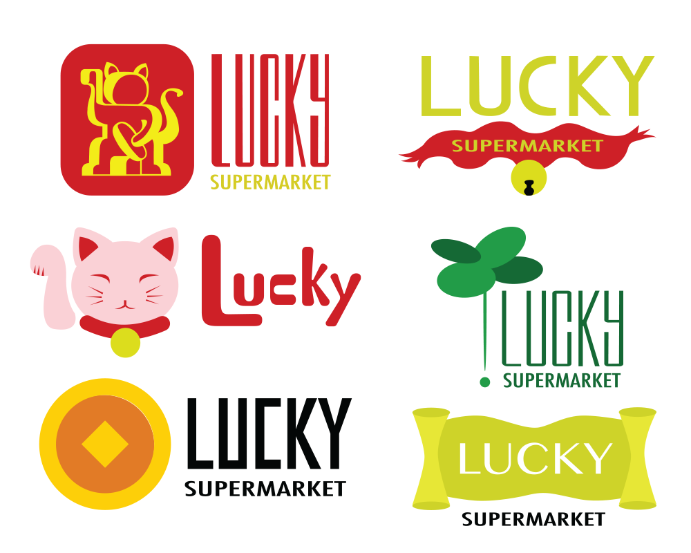
I look at the old logo and focus on the name of the brand. I do research on the word lucky and how it is represented in different cultures. I try out various different ideas by sketching and moving on to digital to play with colour and type. I present the ideas to peers for feedback and move on to finalizing the logo.